In a recent internal meeting, we decided to spend some time improving the appearance of the cube.
The cube is the most symbolic item in the game. Players can find it in almost every puzzle and it plays a significant role.
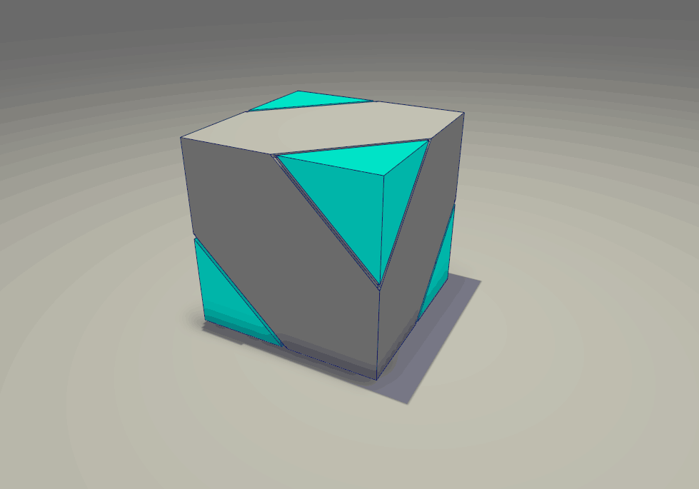
This is how the cube looked originally. It looked good, right? But some of us disagreed. So our artist designed a few more pattern options. They’re all inspired by Rubik’s Cube and the complexity of it.
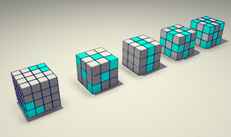
What do you think? My favorite is the first one from the left.
There was a long and drawn out discussion, we liked them, however, we decided to go back to the original one, because these options had too many stripes and barely any simplicity.
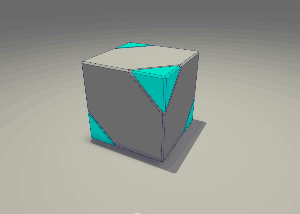
So in the end, few things are changed. But it was worth a try.


